07 Oct 2017
At work we develop user interfaces with Windows Forms. You typically drag and drop components in a visual designer, which generates a designer file. Collaborating with others can be difficult, especially if you work on the same UI elements. If you’re not careful, you’ll end up with a designer file covered in merge conflicts. And since it is automatically generated it is really a pain to solve them. Furthermore, sometimes you know that your file is a 100% correct, and potential merge conflicts in that file could just be ignored.
So, you are in the middle of a merge or rebase and suddenly a conflict infested designer file appears. You would rather just ignore this file, and fix it after the merge is complete. What to do? Luckily, git has an easy command for you! It simply ignore the merge conflicts, and instead picks a file from one of the branches involved in the merge/rebase.
git checkout --ours project/ui.designer.cs
git checkout --theirs project/ui.designer.cs
The flags, --ours and --theirs, control which ui.designer.cs file to pick. There exists two, one in each branch, they are different, and you want only one of them. Unfortunately, the flags switch role depending on whether you are rebasing or merging… I always get confused by this… So to illustrate the difference clearly, let us say that, for instance, you have a feature and a master branch. Then the flags will do the following:
Merging Master with Feature
git checkout feature
git merge master
--ours - Picks file in feature--theirs - Picks file in master
Rebasing Feature onto Master
git checkout feature
git rebase master
--ours - picks file in master--theirs - picks file in feature
18 Sep 2017
Another small git tip, incoming!
Sometimes you commit something, but for some reason immediately regret that decision, and want to undo the commit. There are several reasons for why you want an undo. For me, this can happen when I am doing GitFlow, and accidentally commit to the develop branch because I assumed I had created a feature branch, but had not.
To quickly undo the commit, and keep your changes, do:
This will undo your latest commit, but keep the index and changes in that commit. You could also drop the –soft option. This will leave all changes as unstaged.
And finally, switching from –soft to the –hard option will remove the latest commit, and its index and changes.
16 Sep 2017
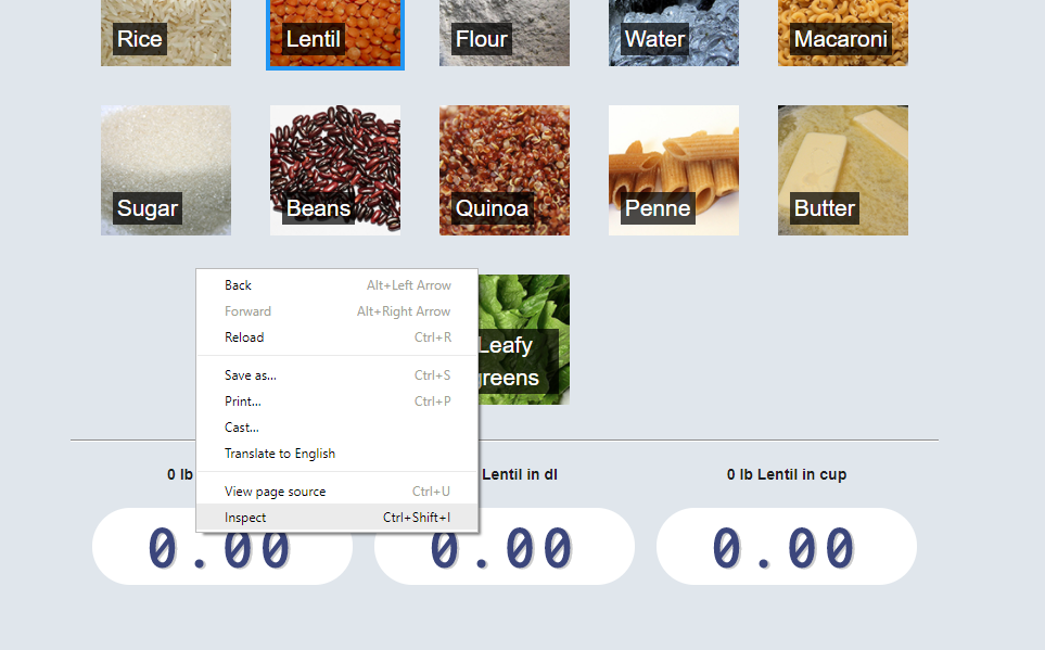
If you want your website to work well on a mobile device there are a lot to consider. My latest project was made with mobile devices in mind. It is a simple cooking converter for recipes. Recipes might use an inconvenient or unfamiliar unit of measurement for an ingredients, such as cup or pound ( At least these units are inconvenient where I live). Having a way to convert the measure while being in the kitchen, cooking, would be nice. The tool was, therefore, made to work well on mobile devices. Below, I’ll mention a couple of tricks that can make your web app work better with mobile devices.
Home Screen App Icon and Short Name
Having a custom image and label on your users’ home screens is a good thing. There are many favicon generators out there. This one works well. Upload your icon and you get favicons suitable for iOS, Android and Metro. Add all the favicons to your project, and add something similar to the code below to your page’s head element:
<link rel="apple-touch-icon" sizes="180x180" href="/public/images/cooking/favicon/apple-touch-icon.png">
<link rel="icon" type="image/png" sizes="32x32" href="/public/images/cooking/favicon/favicon-32x32.png">
<link rel="icon" type="image/png" sizes="16x16" href="/public/images/cooking/favicon/favicon-16x16.png">
<link rel="manifest" href="/public/cooking/favicon/manifest.json">
To improve the label your app will get on the home screen of mobile devices, add two additional elements to your head:
<meta name="apple-mobile-web-app-title" content="Cooking">
<meta name="application-name" content="Cooking">
Mobile-detect
Mobile-detect is a nifty JavaScript package that allows you to identify the device by the User-Agent string of the device’s browser. Using this, you can easily detect if your web app is running on a mobile or tablet device or not, and customize the UI to a particular form factor. For instance, render selectable items in a grid or a carousel depending on what device the user has:
  import MobileDetect from 'mobile-detect';
  ...
  const md = new MobileDetect(window.navigator.userAgent);
  if (md.mobile()) {
    return this.renderFoodSliderItems()}
  }
  else {
    return this.renderFoodItems()
  }
Media queries are great for responsive web apps, and simple to use. It enables you to apply specific CSS styling depending on characteristics of the device. For instance, if the device’s viewport width is less than 800px, use a smaller font size.
p {
  font-size: 4em;

  @media (max-width:800px){
    font-size: 1.5em;
  }
}
Chrome devTools offer Device Mode, which enables you to test your responsive web app. See how it would approximately looks on a mobile or tablet device. This is a very nice feature to have when you’re developing a mobile web app. To enable Device Mode, do:
-
Right click in Chrome and select Inspect, to start devTools.
-
Click the icon towards the lower left corner, which depicts a mobile and tablet device.
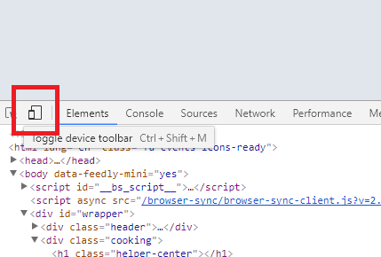
-
Refresh page to allow any web optimizations you have added, to load.
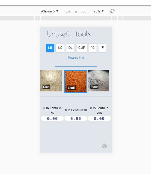
In this view you can see how your responsive web app will behave in different resolutions. It will most likely help you keep your development feedback loop short and sweet.
Please take a look here if you want to see how mobile-detect, media queries, and favicons and metadata were used to create a somewhat mobile optimized web app.
Further Reading
Home screen icon name
Favicon generator
Chrome devTools
30 Aug 2017
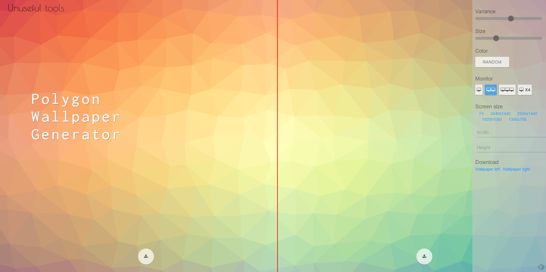
I’ve been using two monitors for about two years now, and there are a lot of great wallpapers that are made for a dual monitor setup. Recently, I saw a low-poly wallpaper that I liked, and wanted something similar. The problem: How to find a colorful low-poly image with the correct resolution. So I’ve made a small tool that can generate low-poly wallpapers in custom resolutions, and it runs in the browser. It used the JS library, Trianglify, which can generate SVG backgrounds.
In the tool you can customize the result by setting a variance and size of the triangles in the generated SVG image. You can split the wallpaper into several chunks, change the color scheme, and download the wallpaper as a PNG image.
Another project I might do in the future, is to extend this generator by creating a custom version of Trianglify.
The tool can be found at here.